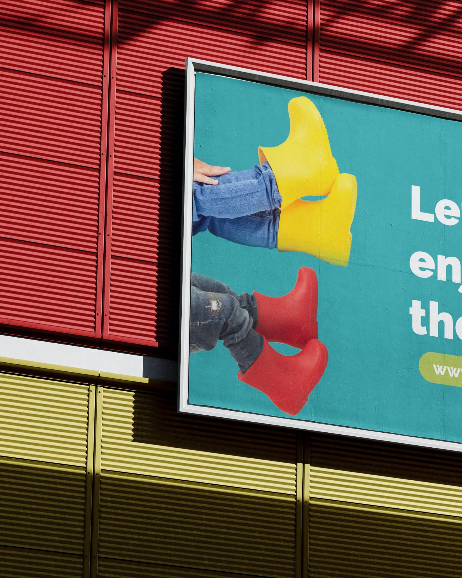
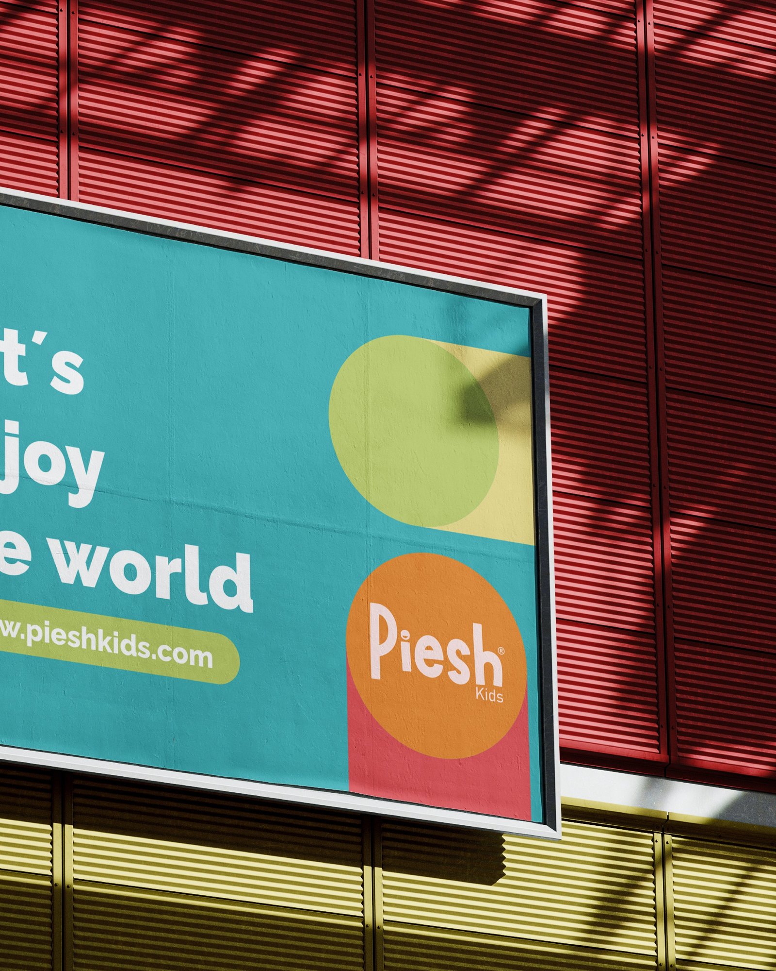
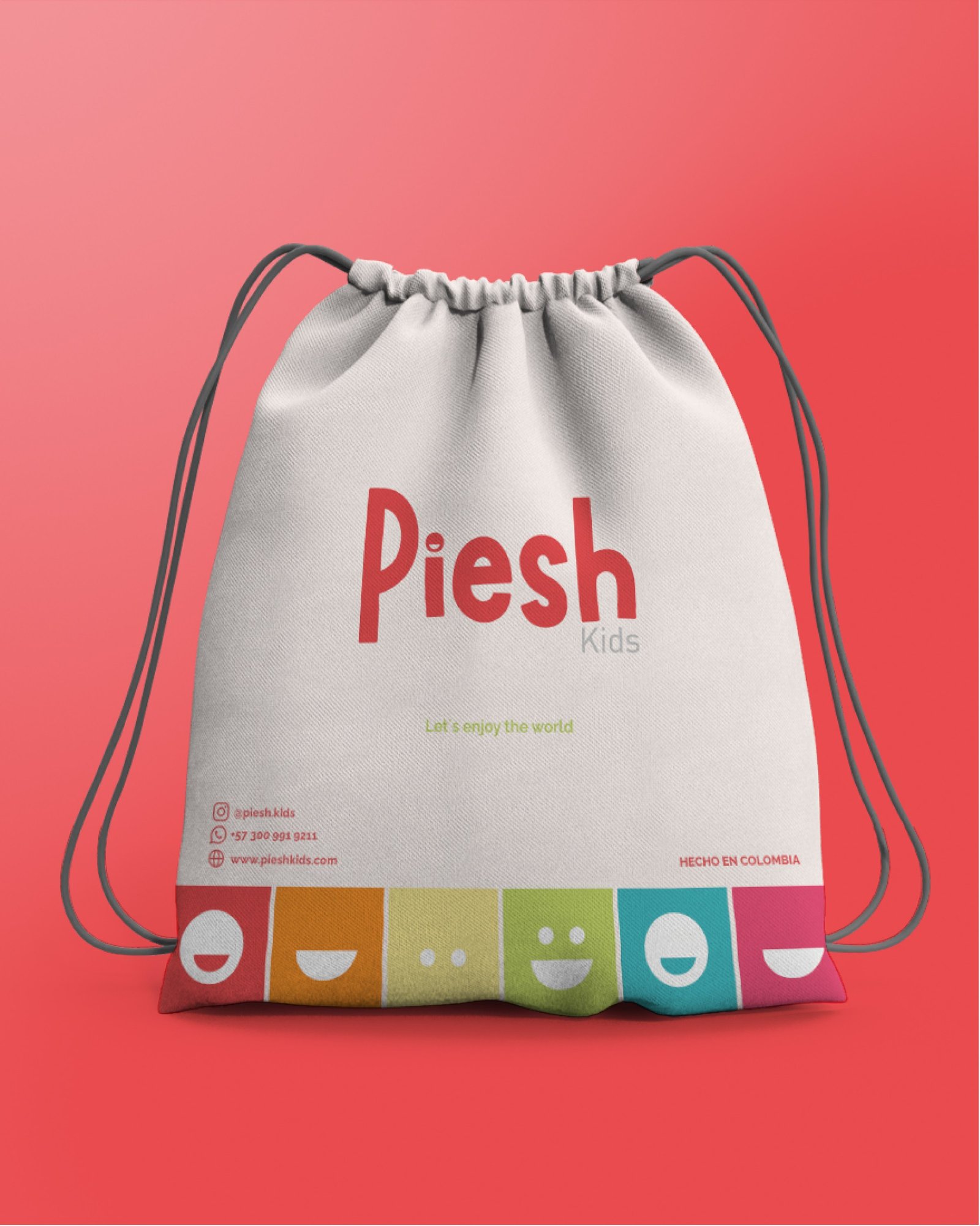
Piesh Kids is a brand of rain boots for children, with the slogan «Let’s enjoy the world». We built its identity around a friendly logotype, with a smile in the «i», and a palette of vivid colors that runs from red to orange, green, turquoise and pink.
The system extends to a fabric bag, a billboard, a pattern of rounded shapes and video pieces for social media: the transition between logo versions, the brand’s faces, and product reels about the new colors and the flexibility of the boot.
Usamos cookies propias y de terceros para que el sitio funcione y para medir cómo se usa. Puedes aceptarlas o rechazar las que no son necesarias. Más información en nuestra política de privacidad.